
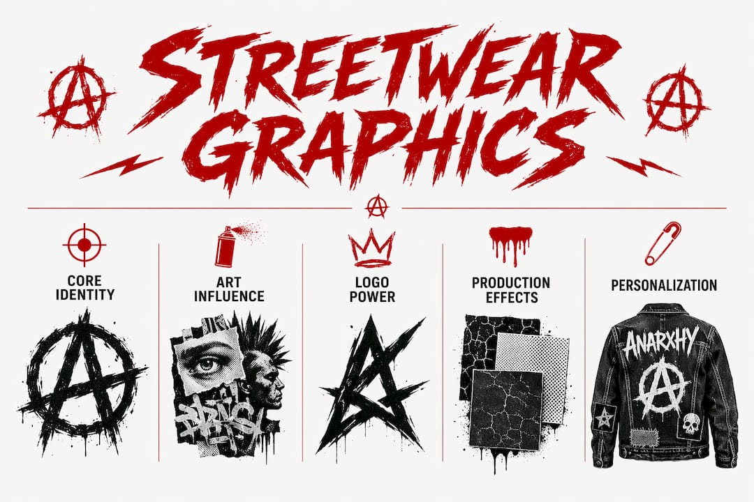
Graphics are the primary identity system in streetwear, functioning as visual signatures that communicate attitude, cultural allegiance, and community belonging far beyond simple decoration. The role of graphics in streetwear identity is not cosmetic. A single image on a chest or back panel tells a viewer exactly who made it, who wears it, and what that person rejects or embraces. Brands like Off-White and Axel Arigato have built entire cultural positions on this principle. Understanding how graphics in streetwear operate as coded language gives you a serious advantage, whether you are designing, styling, or simply choosing what to put on your body.
How do art and graffiti shape streetwear’s visual identity?
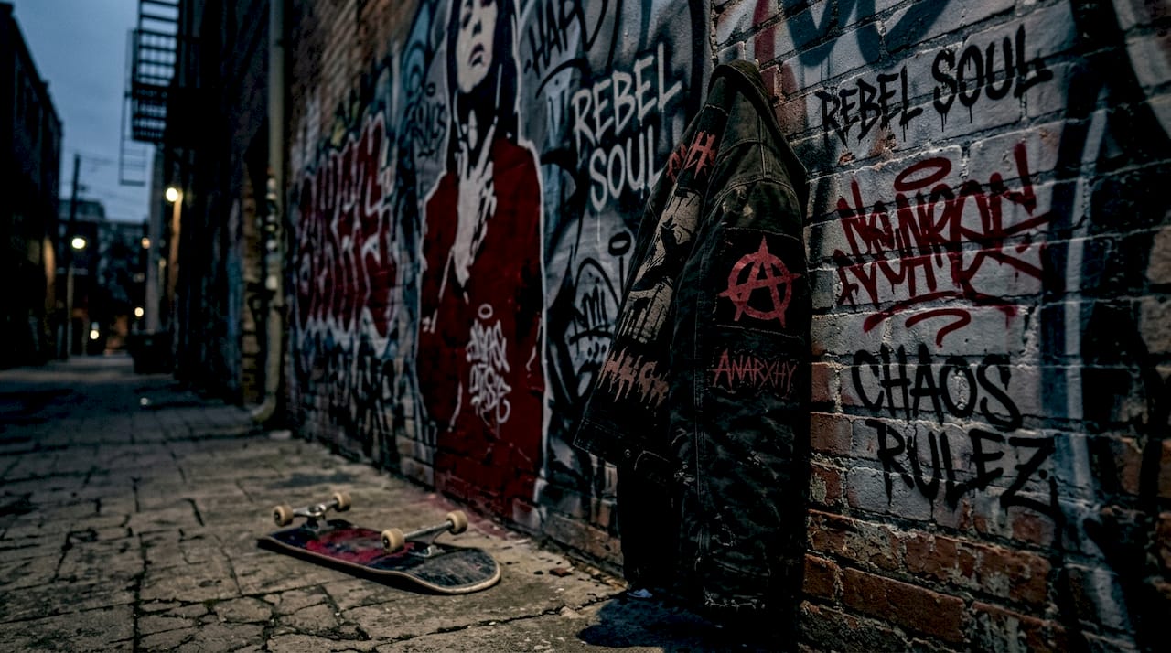
Graffiti is not background noise in streetwear. It is the foundational visual language of rebellion, urban authenticity, and community claim. Early streetwear pulled directly from New York and Los Angeles graffiti culture, adopting its letterforms, color blocking, and territorial symbolism to signal that clothing came from the street, not a design studio. That origin still drives the aesthetic logic of the most credible brands today.
The translation from wall to fabric is more deliberate than it looks. Graffiti writers use layering, contrast, and spatial tension to create visual hierarchy on a flat surface. Streetwear designers apply the same principles to placement graphics, deciding whether a motif lives on the chest, sleeve, or back based on how it reads at street distance and in photographs. The goal is the same: immediate recognition and emotional impact.
Art collaborations extend this logic into new cultural territory. When a brand partners with a muralist or tattoo artist, it borrows that artist’s credibility and community ties. The graphic becomes a co-signed statement, not just a print. This is why graffiti persists as public memory, recycled across media and generations to sustain identity over time. A tag that originated on a Bronx wall in 1983 can reappear on a hoodie in 2026 and carry the same charge, because the cultural memory travels with the form.
Key design elements that graffiti contributes to streetwear graphics include:
- Layered color fields that create depth and visual noise, signaling urban complexity
- Hand-rendered letterforms that reject corporate polish and assert human authorship
- Territorial symbols and tags that mark the wearer as part of a specific scene or city
- High-contrast outlines that read clearly at distance, essential for street-level recognition
Pro Tip: When referencing graffiti in your own designs, study the spatial logic of the original work, not just its surface style. The tension between foreground and background in a throw-up is what makes it visually alive. Copying the color without understanding the structure produces flat results.
What role do logos and symbolic graphics play in expressing streetwear identity?
Logos in streetwear are not branding in the corporate sense. They are semiotic devices that encode status, subcultural literacy, and community membership into a single mark. Off-White’s use of airport arrows and industrial warning stripes is the clearest example of this principle at work. Virgil Abloh took graphics from public infrastructure, stripped them of their utilitarian context, and repositioned them as high-status identity markers. The graphic did not change. The context did. That shift in meaning is the entire mechanism.
Axel Arigato’s mascot emblem operates on a similar but more layered logic. The emblem assembles subcultural visual references including 1990s rap stickers, vintage skate decks, and graffiti throw-ups into a single symbol. Each reference is legible to a specific audience. Someone who grew up skating recognizes one layer. Someone who collected rap mixtape art recognizes another. The graphic rewards cultural knowledge, which is exactly how streetwear identity works. You either get it or you don’t.
| Graphic type | Identity function | Example |
|---|---|---|
| Utilitarian repurposed logo | Converts public symbols into status markers | Off-White’s arrows and warning stripes |
| Subcultural emblem | Encodes layered community references into one mark | Axel Arigato’s mascot emblem |
| Artist collaboration graphic | Borrows credibility and community from a named creator | Keith Haring motifs in luxury streetwear |
| Text-based slogan | States a position directly, inviting alignment or rejection | Anarxhy’s manifesto-driven typography |
Pro Tip: Before designing a logo or emblem, list every subculture your audience participates in. Then identify one visual artifact from each. A mark that synthesizes three of those artifacts will read as culturally fluent, not generic.
The importance of graphics in fashion at this symbolic level is that they create instant legibility. A person wearing a graphic that encodes the right references signals their identity to others who share that cultural vocabulary, without saying a word. That silent communication is what separates streetwear from other fashion categories.
How do production and design constraints shape graphic storytelling?
A graphic that works as a concept does not automatically work on fabric. Apparel graphic designers in skate and streetwear are required to create production-ready files that balance cultural storytelling with manufacturing realities. That means understanding how a design survives screen printing, garment washing, and repeated wear, not just how it looks on a monitor.
The graphic types used in streetwear each carry different production requirements and identity implications:
- Placement graphics on tees require high-contrast artwork that holds detail at standard print sizes, typically 12 to 14 inches wide
- All-over prints demand seamless repeat logic and colorway discipline to avoid visual chaos across seams
- Patches and embroidery reward simplified forms with strong silhouettes, since thread count limits fine detail
- Cut-and-sew panels allow the graphic to become structural, integrating pattern and image into the garment’s construction
| Technique | Best for | Identity effect |
|---|---|---|
| Screen printing | Bold, flat graphics with limited colors | Raw, authentic, street-adjacent |
| Embroidery | Logos, emblems, small crests | Premium, tactile, subcultural prestige |
| All-over sublimation | Complex illustrated prints | High visual impact, collector appeal |
| Discharge printing | Soft, faded, vintage-feel graphics | Worn-in authenticity, anti-corporate tone |
The lived-in finish achieved through discharge or enzyme washing is not an accident. It is a deliberate production choice that communicates history and authenticity. A graphic that looks like it has been worn for years signals that the wearer has been part of the culture for years. Production technique becomes part of the identity statement.
How do collaborations and cultural context influence graphic identity?
Graphic meaning is not fixed. It shifts depending on who made it, who wears it, and where it appears. The Keith Haring and Louis Vuitton Resort 2027 collaboration demonstrates this precisely. Haring’s graphics originated in New York subway stations as public art accessible to everyone. Placed on Louis Vuitton luggage and ready-to-wear, those same graphics acquire a layer of luxury exclusivity that Haring himself would have found contradictory. The visual form is identical. The cultural reading is completely different.
This is not a problem to avoid. It is a dynamic to understand and plan for. When you place a street graphic inside a heritage fashion context, you are creating a conversation between two identity systems. The tension between those systems is what generates cultural interest. The mistake is treating the graphic as an isolated aesthetic element rather than a signal that will be read differently by different audiences.
Four principles for planning graphics in collaborative or cross-context streetwear:
- Map the source culture. Identify where the graphic originates and what it means to the community that created it. Ignorance here reads as appropriation.
- Anticipate the receiving context. Understand how the graphic will be read by the new audience, including what they will project onto it.
- Design for the tension. The most memorable collaborations do not erase the difference between two visual worlds. They make that difference visible and productive.
- Credit the origin. Whether through explicit attribution or design choices that honor the source, acknowledging where a graphic comes from strengthens its authenticity.
Band merch’s influence on streetwear follows the same logic. A graphic that originated as tour merchandise carries the cultural weight of the music, the venue, and the community that gathered there. When that graphic moves into streetwear, it brings all of that context with it.
What is the impact of personalized graphics on individual streetwear identity?
The streetwear graphic is increasingly understood as an extension of the self, not just a brand marker. Research on phygital identity shows that most young people view their visual style, including the graphics they wear, as a direct expression of personality. This is not universal. Some individuals maintain cultural or economic boundaries around graphic adoption, treating certain symbols as earned rather than purchased. That negotiation is itself part of how streetwear identity functions.
Personalized and limited-edition graphics deepen this connection. When a graphic is available to only a few hundred people, wearing it signals not just taste but access and timing. You were there. You knew. Limited drops by brands like Anarxhy operate on exactly this principle, turning the graphic into a membership token for a specific cultural moment.
Key ways personalized graphics shape individual identity in streetwear:
- Custom colorways allow wearers to differentiate within a shared graphic system, expressing individuality without abandoning community
- Limited-edition drops create scarcity that transforms a graphic from product to artifact
- Artist-specific collaborations let wearers align with a creative voice, not just a brand
- Narrative graphics that reference personal or subcultural history reward close reading and reward the wearer’s own story
Tour merch’s role in subculture fashion illustrates how a graphic tied to a specific moment in time becomes a personal archive. The graphic does not just represent the brand. It represents where you were and who you were with.
Key takeaways
Graphics in streetwear are identity systems, not decorations, and every design decision from technique to placement encodes cultural meaning that either earns or loses community trust.
| Point | Details |
|---|---|
| Graphics as identity systems | Every graphic communicates attitude, community, and cultural position before a word is spoken. |
| Graffiti as foundational language | Urban art forms supply the visual logic, spatial tension, and rebellion that give streetwear graphics their credibility. |
| Logos encode subcultural literacy | Marks like Off-White’s arrows and Axel Arigato’s emblem reward cultural knowledge and signal belonging to specific communities. |
| Production shapes meaning | Techniques like discharge printing and screen printing are identity choices, not just manufacturing decisions. |
| Context shifts graphic meaning | The same graphic reads differently in streetwear versus luxury fashion, making cultural context a design variable. |
Why I think most creatives underestimate the system behind the graphic
Most people treat a streetwear graphic as a single artwork. I think that framing is the source of most weak designs. A graphic on a hoodie is not a painting. It is one node in a system that includes the garment’s silhouette, the brand’s history, the wearer’s body, and the cultural moment the drop lands in. When you design only for the image and ignore the system, you get something that looks good in isolation and reads as hollow in the wild.
The iterative, collaborative process behind strong identity design is what separates brands that build lasting cultural equity from those that produce one memorable season and disappear. Working with artists who have genuine roots in the communities you are referencing is not optional. It is the difference between a graphic that resonates and one that gets called out.
For emerging creatives, the practical lesson is this: before you finalize any graphic, ask what it means to the person who did not design it. Show it to someone from the culture it references. If they recognize something true in it, you are on the right track. If they see a surface impression, go back. Authenticity in streetwear graphics is not a feeling. It is a result of specific, grounded decisions made at every stage of the process.
The brands I respect most, including Anarxhy, treat the graphic as a manifesto fragment. Every piece in a collection is a sentence in a longer argument about who the wearer is and what they refuse to accept. That consistency is what builds community, not just customers.
— Johnathan
See Anarxhy’s graphic-driven streetwear in action
Anarxhy builds every collection around the principle that a graphic should say something the wearer cannot say out loud. The SYSTEM ERROR hoodie from the Signal Lost series is a direct example: dystopian typography and disrupted visual codes printed on eco-friendly fabric, designed for people who live outside the mainstream narrative. The graphic is not decoration. It is the point.
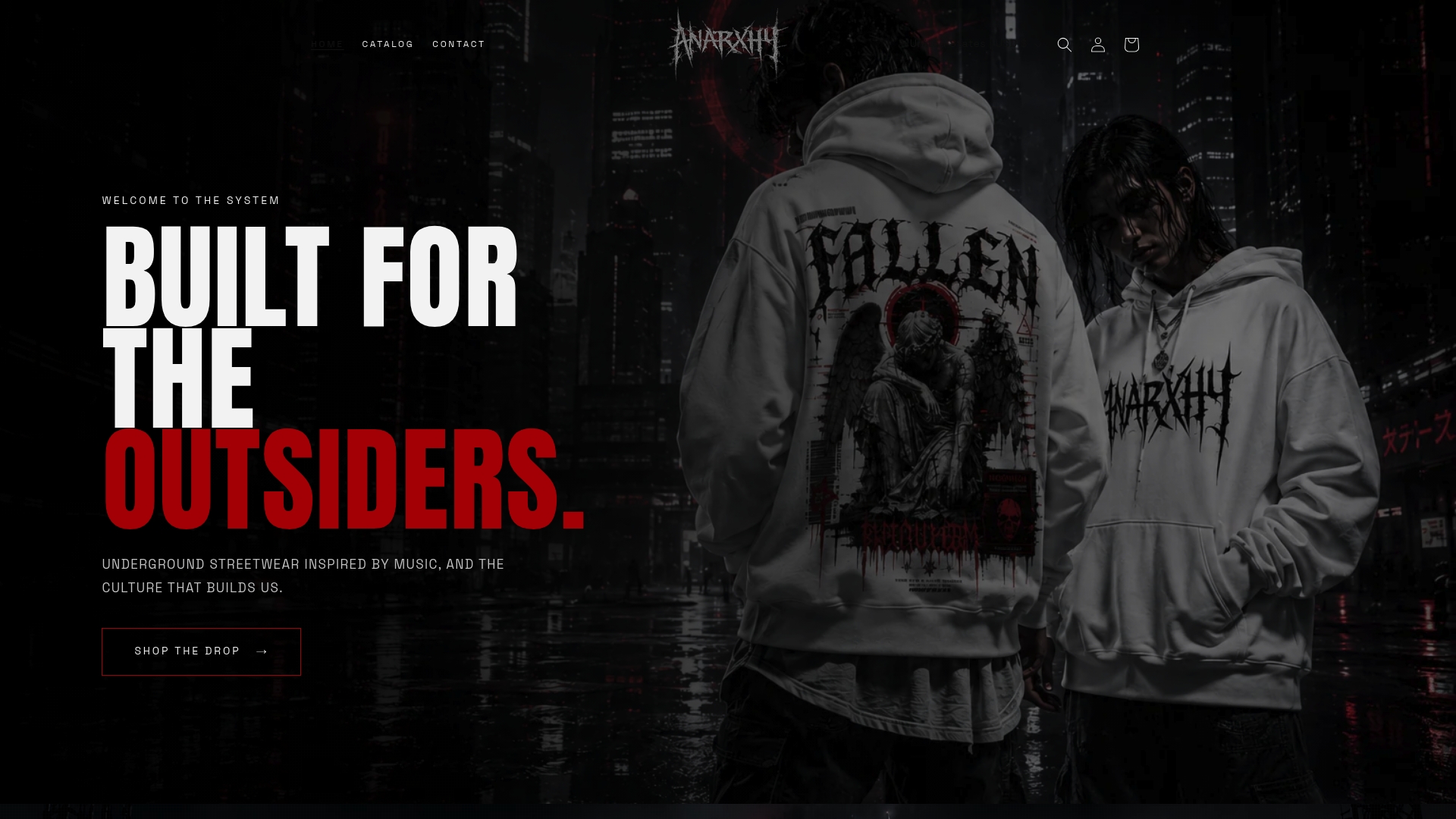
Anarxhy’s limited drops mean each graphic stays rare, which keeps the identity signal strong. If you want streetwear that carries real cultural weight rather than borrowed aesthetics, the full collection is where to start. Every piece is built for wearers who understand that what you put on your body is a statement, not a style choice.
FAQ
What is the role of graphics in streetwear identity?
Graphics in streetwear function as visual identity systems that communicate brand attitude, cultural values, and community membership. They operate as coded language, readable by those with the cultural knowledge to interpret them.
How do graffiti and street art influence streetwear graphics?
Graffiti supplies the foundational visual logic of streetwear, including layered color, hand-rendered letterforms, and territorial symbolism. These elements signal urban authenticity and rebellion, which are core values in streetwear culture.
Why do logos matter so much in streetwear?
Logos in streetwear encode subcultural references and status signals into a single mark. Off-White’s repurposed airport arrows and Axel Arigato’s emblem both demonstrate how a logo rewards cultural literacy and signals belonging to specific communities.
How does production technique affect a graphic’s identity message?
Techniques like discharge printing create a worn, authentic finish that communicates history and credibility. Screen printing produces bold, flat graphics that read as raw and street-adjacent. The production method is an identity choice, not just a manufacturing decision.
Can the same graphic mean different things in different contexts?
Yes. Keith Haring’s graphics originated as accessible public art and carry entirely different cultural weight when placed on Louis Vuitton products. Context, institutional setting, and audience all shift how a graphic is read and what identity it signals.