

Typography in clothing design is the deliberate use of letterforms, font selection, spacing, and hierarchy to communicate brand identity and visual meaning directly on a garment. It is not decoration. Every font choice carries weight, signals intent, and shapes how a wearer and observer interpret a brand’s values. The role of typography in clothing design spans from technical print constraints to deep psychological brand signaling, making it one of the most consequential decisions a fashion designer makes. Understanding both the production rules and the cultural codes behind type gives you a real edge in apparel design.
What are the technical considerations for typography in apparel printing?
Typography on fabric lives in a physically hostile environment. Ink spreads, fabric stretches, and seams interrupt letterforms in ways that a flat screen never will. Getting type to survive that environment requires specific technical decisions before any aesthetic choices are made.
Minimum stroke widths of 1–2mm are required for typography to remain legible in DTG (direct-to-garment) printing. Hairlines thinner than 0.5mm fail visually after printing. That threshold eliminates a wide range of decorative and script fonts from practical apparel use without significant modification.
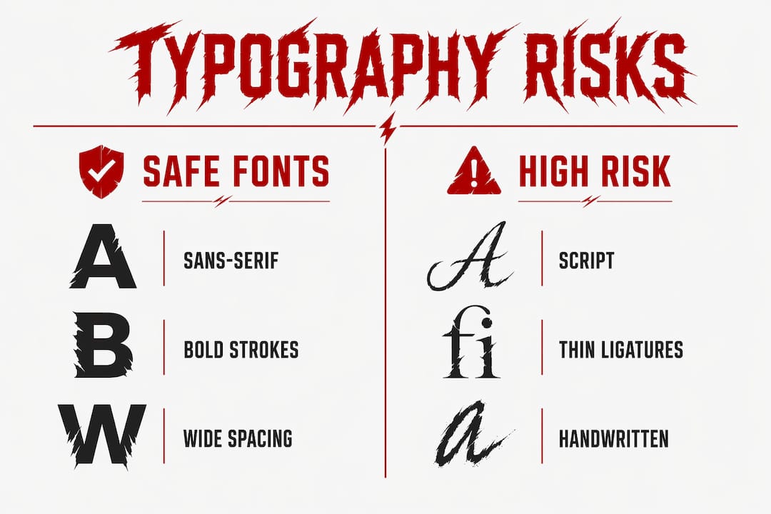
Script and handwritten fonts carry the highest production risk. Their thin connecting strokes, called ligatures, close up or disappear entirely after ink spreads into fabric fibers. Script fonts fail in apparel printing precisely because those delicate connections cannot survive the minimum stroke width requirement. Designers who love script styles must either thicken strokes manually or accept that the printed result will look nothing like the digital file.
Sans-serif fonts are structurally consistent and tolerate DTG, screen printing, and heat transfer methods reliably. Their uniform stroke widths and absence of serifs reduce the risk of print defects caused by ink spread. That makes them the default safe choice for high-volume or technically complex apparel runs.
Typographic hierarchy on a garment also requires a specific scale relationship. A 3:1 font size differential between headline and supporting text creates clear visual hierarchy. Smaller ratios cause visual competition, where the eye cannot determine what to read first. On a chest print, that confusion reads as clutter.
| Font category | Print compatibility | Risk level | Best use case |
|---|---|---|---|
| Sans-serif | High across all methods | Low | Body text, logos, streetwear graphics |
| Serif | Moderate, depends on stroke weight | Medium | Heritage branding, chest statements |
| Script | Low, ligatures often fail | High | Accent only, with stroke adjustment |
| Decorative | Variable, test required | High | Limited use, large-scale placement only |
Pro Tip: Always request a physical strike-off sample before approving a final apparel design. Digital proofs do not replicate ink spread, fabric texture, or color shift on actual garment material.
How does typography convey brand identity and mood in fashion design?
Font choice is a subconscious brand promise. Typography anchors brand recognition across seasons even when collections, colorways, and silhouettes change entirely. A brand’s typeface is often the single most consistent visual element it owns.
Four main typographic archetypes define how fashion brands signal identity: Serif, Sans Serif, Script, and Decorative. Each archetype carries a distinct set of cultural associations that consumers read without thinking. Choosing the wrong archetype for your brand’s positioning creates a disconnect between what you say and what you look like.
Here is how each archetype communicates in a fashion context:
- Serif fonts signal heritage, authority, and luxury. High-contrast serifs are chosen by luxury houses because their delicate hairlines and visual friction demand attention and signal craftsmanship. They communicate that a brand has history and discipline.
- Sans-serif fonts project modernity, accessibility, and youth. They read as direct and uncluttered, which suits streetwear, activewear, and contemporary fashion brands targeting younger demographics.
- Script fonts suggest personality, femininity, and artisanal craft. They work well for lifestyle brands and boutique labels but require careful technical handling in print production.
- Decorative fonts express attitude, subculture, and disruption. They are high risk and high reward. Used well, they define a brand’s visual voice. Used carelessly, they read as noise.
Luxury typography uses generous letter spacing and lighter weights to create visual breathing room, reinforcing exclusivity and craft. That wide tracking communicates unhurried confidence. A streetwear brand using the same approach would read as cold and inaccessible. The same technical choice produces opposite emotional results depending on context.
Typography in fashion functions as a subconscious arbiter of brand status and philosophy, reflecting artisanal mastery or modern minimalism. That is why typeface selection is not a finishing touch. It is a foundational brand decision that shapes how every other design element is interpreted. Understanding typeface selection and brand positioning is especially critical in streetwear, where visual identity carries cultural weight.
What challenges does fabric and garment design present to typographic clarity?
A garment is not a poster. It curves, folds, stretches, and moves with a body. Every one of those physical realities distorts letterforms in ways that flat digital layout design never encounters. Designers who treat apparel like a static canvas consistently produce work that looks strong on screen and weak in person.
Typography for apparel must function like signage: clear hierarchy, high contrast, and generous spacing to survive movement, texture, and imperfection on fabric. That means the design principles that work in editorial layouts need significant adjustment for garments. Tight tracking, thin strokes, and low contrast all fail faster on fabric than on paper.
Fabric curvature is the most underestimated challenge. A chest print that reads perfectly on a flat lay looks compressed or stretched once worn. Side seams interrupt horizontal text. Necklines pull type upward. Designers must mentally simulate how a garment sits on a body at rest and in motion before finalizing any typographic placement.
Size range adds another layer of complexity. Typography hierarchy must be tested across size ranges and body shapes because placement, scale, and distortion vary with garment size and wearer anatomy. A design that reads clearly on a medium may lose its hierarchy entirely on an XS or an extended size. Calibrating type on a single sample size is a design flaw, not a shortcut.
Pro Tip: Print your design on paper, cut it out, and drape it over a dress form or a person before submitting final files. This reveals placement problems that no digital mockup will catch.
How can typography enhance visual communication and storytelling in apparel?
Typography is a system, not a single element. When hierarchy, contrast, and spacing work together, type creates a clear message that a viewer absorbs in seconds. When those relationships break down, the garment reads as busy or confusing, and the brand message disappears.
Effective typographic storytelling on apparel follows a clear sequence. Here is a practical framework for building type-led apparel graphics:
- Define the primary message. Decide what one phrase or word the viewer should read first. That element gets the largest scale and highest contrast.
- Establish a secondary layer. Supporting text, a tagline, or a date sits at roughly one-third the scale of the primary element, following the 3:1 hierarchy rule.
- Add a tertiary detail sparingly. A small brand mark, a URL, or a collection name anchors the design without competing for attention.
- Apply restraint to spacing. Generous spacing between letterforms and between text blocks prevents visual crowding. Tight spacing on fabric reads as a single dark mass, not as words.
- Integrate with other design elements. Color, silhouette, and graphic imagery should support the type, not fight it. Type placed over a busy graphic loses legibility fast.
Restraint is the most underused tool in apparel typography. The instinct to fill space with text works against readability on a moving, three-dimensional surface. The most memorable graphic apparel designs use type sparingly and give each element room to breathe. Checking current graphic design trends in streetwear shows how the strongest pieces often rely on one bold typographic statement rather than a dense composition.
Color contrast between type and fabric is not optional. Low-contrast combinations, like gray text on a dark navy ground, fail in varied lighting conditions. High contrast, particularly black on white or white on black, survives the widest range of real-world viewing conditions and printing methods.
Key Takeaways
Typography in clothing design is a technical and cultural discipline that determines whether a garment communicates clearly, survives production, and builds lasting brand recognition.
| Point | Details |
|---|---|
| Stroke width is non-negotiable | Maintain minimum 1–2mm stroke widths to prevent type from failing in DTG and screen printing. |
| Font archetype signals brand values | Serif, sans-serif, script, and decorative fonts each carry distinct cultural codes that shape consumer perception. |
| Hierarchy requires a 3:1 scale ratio | Set headline type at least three times larger than supporting text to create clear visual priority on a garment. |
| Fabric physics distort letterforms | Test typography across size ranges and on a physical form, not just a flat digital mockup. |
| Restraint produces stronger designs | Fewer typographic elements with generous spacing outperform dense compositions on moving, three-dimensional surfaces. |
Typography as a design tool, not an afterthought
I have reviewed hundreds of apparel submissions where typography was clearly the last decision made. The silhouette was considered, the colorway was debated, the graphic was refined, and then someone dropped a font on top and called it done. That approach produces garments that look assembled rather than designed.
The shift I have seen in stronger work is treating type as a structural element from the first sketch. When you decide early that a sans-serif at a specific weight will carry the brand voice, every other design decision responds to that anchor. The graphic supports the type. The color palette amplifies it. The silhouette frames it. That sequence produces coherence.
The other lesson I keep returning to is that technical constraints are creative constraints, and creative constraints produce better work. Knowing that your script font will fail at anything under 1–2mm stroke width does not limit you. It forces you to find a version of that idea that actually survives contact with fabric. The printed result is almost always stronger than the original concept.
Typography in apparel is also where brand equity accumulates invisibly. Consumers do not consciously notice that a brand has used the same typeface family for six seasons. They just feel that the brand is consistent and trustworthy. That feeling is worth protecting. Changing your core typeface without a clear reason is one of the fastest ways to erode recognition you spent years building.
— Johnathan
Anarxhy’s approach to typography-driven apparel
Anarxhy builds its collections around the idea that clothing should say something without asking permission. Typography is central to that approach, not as decoration but as the primary carrier of the brand’s outsider ethos and dystopian visual language.
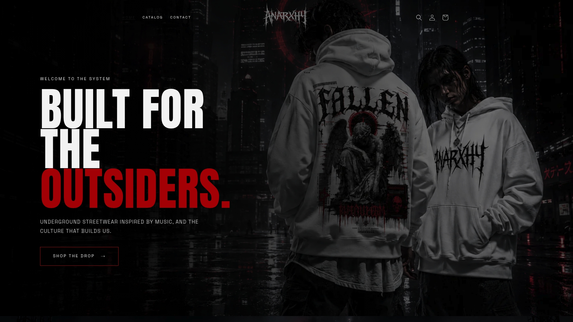
The DIGITAL DECAY hoodie shows what happens when typographic design is treated as a structural decision from the start. The letterforms are bold, the hierarchy is clear, and the message lands in under a second. For designers and enthusiasts who want to see how typographic principles translate into finished apparel, Anarxhy’s limited drops offer a direct study in type-led garment design. The brand uses eco-friendly materials, so the design integrity extends beyond the visual layer.
FAQ
What is the role of typography in clothing design?
Typography in clothing design defines visual communication, brand identity, and consumer perception through deliberate font selection, hierarchy, and spacing. It functions as both a technical and cultural tool that shapes how a garment is read and remembered.
Which font types work best for apparel printing?
Sans-serif fonts perform best across DTG, screen printing, and heat transfer methods because their uniform stroke widths resist ink spread. Script and decorative fonts carry high production risk due to thin connecting strokes that often fail after printing.
How does font choice affect brand perception in fashion?
Font choice acts as a subconscious brand promise, with serif fonts signaling luxury and heritage, sans-serifs projecting modernity, and decorative fonts expressing subculture or rebellion. Consumers absorb these signals without consciously reading them.
Why does typography look different on fabric than on screen?
Fabric stretches, folds, and curves with the body, distorting letterforms that appear clean on a flat digital file. Ink also spreads into fabric fibers, which closes up thin strokes and reduces contrast, making physical sampling a required step before final approval.
How do I create clear typographic hierarchy on a garment?
Set your primary text at least three times larger than any supporting text, apply high contrast between type and fabric color, and use generous spacing between elements. Testing the design across multiple garment sizes confirms that the hierarchy holds at every scale.